
The Howard Peters Rawlings Conservatory - Design Sprint
The Basics
Project Type: Website redesign
Institution: Tech Fleet - Baltimore
Timeline: Eight weeks
My role: Apprentice UX Researcher
Location: Remote
Tools: Figma, Miro, Google Forms, Trello

Summary

Problem: The HP Rawlings Conservatory website was quickly becoming non-functional as it hadn’t been updated (both aesthetically and on the back end) in over ten years.

Research: Our team found that in several instances, the site failed most of Jakob Nielsen's 10 Usability Heuristics and was severely lacking in content and usability compared to its competitors.
Solution: Using Google Analytics, we found that on a mobile wireframe users were more capable and confident when purchasing a ticket, making a donation, and signing up to be a volunteer.
Takeaways:
1. Sometimes the most simple solution is the best one.
2. Constraints can often lead to very inventive ideas.

Project kick off
The H.P.Rawlings Conservatory & Botanic Gardens website project was the second external Tech Fleet project, and was selected by Tech Fleet founder Morgan Denner in early 2021. The project leader gave a project kickoff presentation to the group that gave some summary background to the project, and detailed out some key constraints and unique aspects of this project.
Major constraints:
The website had to remain on WordPress.
The logo must not be changed or altered.
The donations page, designed by the city of Baltimore, could not be changed or altered.
The ticket transaction page, designed by the city of Baltimore, could not be changed or altered.
The redesign had to withstand without needing significant future updates.
Project goals:
Make the user experience accessible to ensure all groups, particularly younger users and elder users, can still accomplish their site visit.
The primary stakeholder also wished for us to focus on:
Encourage visits
Encourage volunteering
Encourage donations
Encourage rentals
Educate visitors on photo permit policy
Research the context

Stakeholder Interviews:
We started the project with an interview with our primary stakeholder, the Conservatory Supervisor. With our discussion guide, we wanted to understand what the stakeholder expected from the project, any pitfalls the team may encounter, and the awareness around the website’s current users.
Additionally, we also interviewed three of our secondary stakeholders: members of the Friends of the Conservatory, a supportive organization for the building and its facilities.
Key take aways:
The website is failing in comparison to their competitors.
The Conservatory is a very special but unappreciated landmark of Baltimore.
Budget restrictions are some of the biggest problems for the Conservatory.
The majority of users and visitors are those who already know and love the Conservatory.

Competitive Analysis
Because the site and many of its functions were recognizably out of date, we conducted a competitive analysis to better understand how the current conservatory and botanical gardens industry have designed their website, with the express focus on how they direct users towards purchasing a ticket, making a donation, and becoming a volunteer.
Key take aways:
There was a consistent theme of repeating 5 main categories on the primary header: Visit. Events. Rentals, Donations, Volunteering Options
There was often multiple ways to do the same thing: under “plan your visit” you could buy tickets, but there was also a CTA to purchase tickets.
The Above-the-fold content is focusing on 3 main things: Encouraging users to come visit the gardens, showing users what their gardens actually look like with striking and large imagery, explaining reasons why they should visit: with events, promotions, exhibitions, and more.

User Survey
Over several sessions, the research team worked together to create a series of questions — largely quantitative, some more qualitative — to help us learn about our potential user base. The goal was to gather information about how people from the Baltimore area and elsewhere use websites like the Conservatory’s to plan events and visits. We each shared the survey link (via Google Forms) with our respective networks (including several Reddit threads and Slack channels) and were able to elicit 73 responses.
Key take aways:
The top reason (45.8%) for visiting the Rawlings Conservatory: “I drove/walked past it”.
53% of users support causes by “Donating Directly”.
Instagram was a top four reason for selecting an attraction to visit.

Affinity Map
From our heuristic analysis, stakeholder interviews, card sort results, survey results and Google analytics review, we were able to use an affinity map to gather ideas and find common themes among the quantitative data, utterances, and insights.
Key take aways:
People are open and want to donate but the task is difficult to complete and find on the website
People are interested in volunteering to support their community, meet new people, and learn. It's hard to understand what kinds of volunteer opportunities Rawlings offers
Lack of consistency in the site architecture, lack of system visibility, and some malfunctioning features pose issues with accessibility and broader usability.
Define the problem
Heuristic Analysis
The team performed an heuristic analysis of the Rawling’s website using Jakob Nielsen’s 10 general principles for interaction design by the Nielsen Norman Group. We found several violations ranging from major to minor problems and came up with solutions on how to address those problems. The worst fell under the categories: Visibility of Systems, Consistency and Standards, Aesthetic and Minimal Design, and Help and Documentation.
It was pertinent that we kept the stakeholder’s goals in the back of our minds while we completed this exercise, to make sure we would be analyzing the website for a very wide audience and demographic, as well as visitors coming to the site to perform a wide range of tasks.
Key take aways:
Users are unable to determine next steps, therefore are not informed of the consequences of their actions.
Words, situations and actions are not consistent across the entire platform, nor do they follow convention (internal/external consistency).
There is information on the main pages that is irrelevant or rarely needed, creating elements that visually competing.
There is No “Help/FAQ section”, forcing a user to exit the site and call the Conservatory directly.

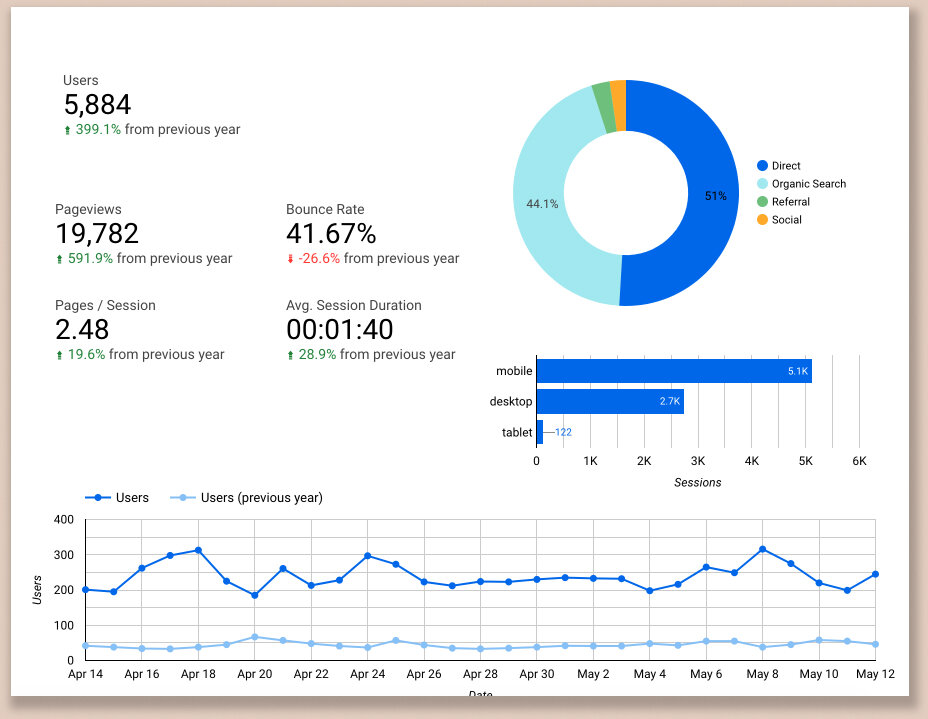
Google Analytics Review
We analyzed the Google Analytics data for the Rawlings Conservatory website to better understand traffic patterns and user behavior to generate recommendations for the website as they relate to the scope and goals of this project.
Key take aways:
The majority of website users come from mobile traffic, nearly doubling desktop and tablet traffic.
The “Visit Us” page has the 2nd highest number of Pageviews. Directing customers to the Baltimore Parks & Recreation website means that we’re sending potential customers off-site in order to convert.
The volunteer page is the 15th most visited page and has a bounce rate of about 76%. This metric results in a lack of awareness of volunteer opportunities, as well as extremely poor usability.
The “Donate” page was the 24th most viewed page on the website and has a 100% bounce rate. This indicates a significant loss of revenue, as well poor accessibility and site engagement for the donation page.
Ideate many solutions
Information Architecture + Card Sort
With the information we gathered through the heuristic and competitive analyses, we were able to build the proposed hierarchy of information for the new website. We then used this information to create our card sort.
We ran an open card sort using the tool UXTweak because we could better understand how users group our content and the terms or labels they give each category. With 89 completed card sorts, we were able to confirm many of our assumptions in our proposed IA through analyzing the similarity matrix and the dendrogram.
Prototype ‘til perfection

Usability Interviews
We interviewed 6 users, all identified and recruited from the original research survey as interested parties. The Conservatory is a well-loved icon amongst Baltimore historians and plant-lovers alike so they were eager to provide feedback to enhance the website.
Key take aways:
60% of users successfully completed the volunteer task.
100% of the users successfully completed both the photo permit and donation tasks.
The users rated the average ease of completing the tasks as a 6.4/7.
The users rated their average confidence of completing the tasks as a 6.5/7.
Mobile wireframe
We chose to create a mobile wireframe based on the results from the Google Analytics review and the card sort. Given that the user base was often very tech-averse, we made a seemingly fully functional wireframe as to not confuse the test users. With our data and stakeholder goals in mind, our designers:
Created very prominent CTAs for both the Donate and Volunteer pages.
Created a new volunteer sign-ups page that would be managed under Google Forms.
Employed our proposed IA with clear hierarchies and header navigations, including highlighting the Photo Policy.
Mid-fidelity prototype
After research, analytics reviews, and a successful wireframe, we created a mid-fidelity prototype to present to our client for review. The next step would be implementing this, along with the new template, onto the old website.
Take aways
What worked well.
Starting with a competitive analysis as a base point for naming conventions as well as general site structure was great way to build a really solid foundation for next steps. Mental models, while containing potential to stifle creativity, are always good to keep on hand when an entry point to a project may seem overwhelming.
Challenges.
Right from the start one, the constraints around this project were massive barriers for creativity and future design. The site really should be designed from the ground up to ensure longevity, but given an eight week design sprint, choosing a more manageable template from WordPress ended up being more effective for this project.
Advice for future researchers:
When considering stakeholders, consider not only their goals, but their own capabilities. If the project you design is far beyond their own use to maintain, even if it works well for the customer on the front end, then you’ve really done nothing sustainable. Often times with government-run operations, the site or application is maintained by a small group and even more common, very few of that group will be tech-savvy. So design for all users, not just the customer.